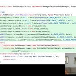
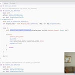
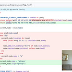
The implementation of something like Plot’s waffle chart seemed obvious until I peeked under the hood and saw how Mike Bostock pulled this off with a surprisingly little amount of code.
I rarely have the need to use D3.js anymore, unless I’m writing up a very custom data visualization - like this mapping of Near Earth Asteroids data, and tools like Plot come in handy to give me the most amount of sensible defaults and control without having to deal with the minutia of SVGs and DOM interactions.
Links referenced in this episode:
waffle mark 🧇 commit on Github


Share this post